.jpg "Banner 1")
.jpg "Banner 2")

Tips for designing effective banner ads
Use color
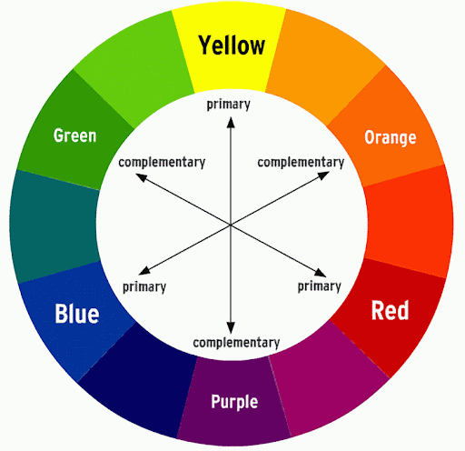
Banner is one of the most popular advertising tools today because it is both effective and cost-effective. Therefore, this is the top advertising option chosen by many companies. Basically, the design color is the first thing to keep in mind when designing a banner or a media publication, and the note to remember about the color system when designing with online and offline publications is:
Online Publications
Colors when designing as well as exporting image files often use the RGB color system so that the image files after being designed will have the same colors as in the design process and the colors are shown clearly and with the right message. unaffected by image color.
Publication offline (print)
For this type, you need to use the CMYK color system to design for print purposes, this color system gives the same color quality and image fidelity as the computer version of the design. The CMYK color system will usually not be as fresh as the RGB color system, but will bring the image quality color as the design.
Therefore, the color scheme or the use of the color system in a design is extremely important. Depending on the nature of the business and the requirements of the customer, choose colors to match the publications. It is not recommended to use too many colors in a communication design publication, except for events about painting, art, etc. to avoid the viewer being confused and difficult to receive the message.
There are two basic types of fonts: serif (sans serif) and sans serif (sans serif). In which, sans serif fonts are more recommended in design publications. In the design of publications with a modern breath, there are a few issues that you need to learn from:
- Avoid using too many fonts (>= 5 fonts) on the same design publication, to avoid being idle for viewers.
- Limit the use of serif fonts like Time New Roman in the design, use sans serif fonts.
- Limit or should not use too fancy typefaces
- Use clear, easy-to-read font sizes. You should also pay attention to the purpose of using the publication to choose the appropriate font size and font.
- Line spacing between letters should not be too tight nor too far.
- Titles and headings need to use easy-to-see, easy-to-follow fonts.
- Attention should be paid to the use of appropriate fonts and encodings, and Unicode fonts with accents should be used in the design.
Principles of layout
The layout of a design depends on the requirements as well as the characteristics of the product or service we want to promote. A coherent layout with enough basic components is the top criterion, simple but very important in designing a beautiful and impressive banner. An advertising banner with a full and clear layout not only helps viewers grasp information quickly but also creates a sense of convenience and satisfaction. The design layout is also divided into 2 main styles:
Traditional style layout
This type of publication is usually serious in nature, they consist of three main parts as follows:
- Upper part: Set logo and title
- Middle part: Program name, main activities covered by the publication and main contents.
- Below: Contact information, additional information, sponsors
Modern style layout
With a layout with a modern breath, it is often directed to freedom, creativity, breaking the position of the main content above and is often used in big events, young and modern, ...
However, despite being creative to have a beautiful design, there are still a few points to keep in mind:
- Logo arrangement: The larger unit/organization, the logo will be on the left, the smaller will be on the right. If there are an even number of logos, they can be divided into 2 on 3 sides of the title, or can be circumvented by having a large logo dimmed in the publication.
- You should use all capital letters in a sans-serif font for the title title and the name of the organization and owner of the publication, these contents should be placed next to the logo.
- The name of the program, the name of the main content of the publication needs to be written loud, clear and placed in positions that impress the viewers.
- If the content is in some part hard to see, you can use a text border effect or blur the frame behind the object to make it more prominent.
- You can use icons to replace some information such as: Phone, website, address, etc.
Background principles and details
One last important design note - background principle and other details together give character to the publication, we'll be able to choose different backgrounds to suit you, you have flexibility use backgrounds like:
- Image background: You can choose a photo, any photo frame and blur them to create a background, or you can also use the original image with many blank spots on the image to create a background.
- Color background: By using flat color backgrounds together, or you can also use array colors to combine with textures if available.
In the principle of beautiful banner design, you should avoid using too many details and colors because it easily affects the main objects on the publication, as well as causing confusion and discomfort to the viewer.
.png "OAS")


NT GROUP
54 - 56 Phan Khiem Ich, Phu My Hung , District 7, Ho Chi Minh City , Viet Nam
028 9 253 250 | 028 8 334 539 | admin@ntgroup.com.vn | www.ntgroup.com.vn


27491 Online : 2
© Copyright 2016 NTGROUP